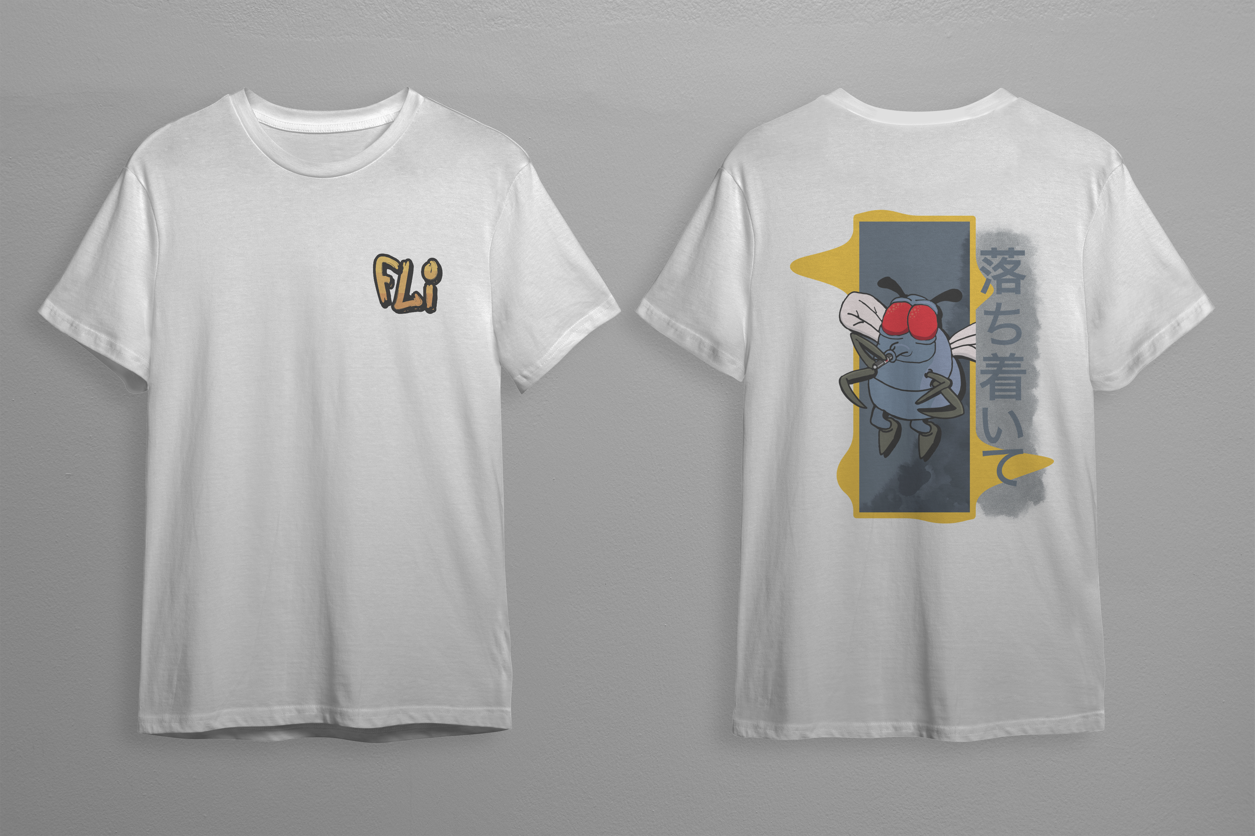
VapeFli is a vape retailer in Lydenburg, Mpumalanga. The brief was to make the shop easier to recognise in a crowded category and to speak to new and returning customers without relying on generic product imagery.
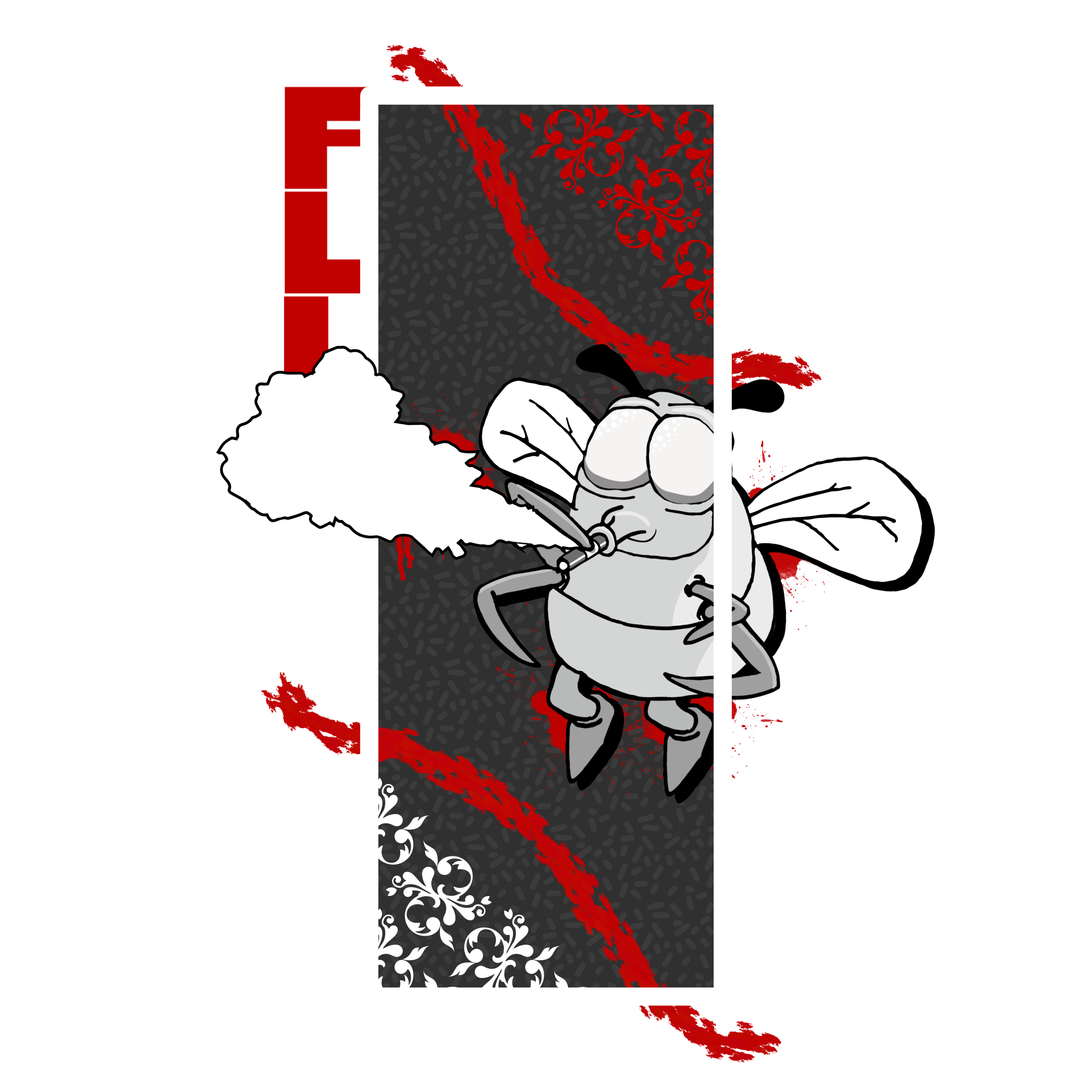
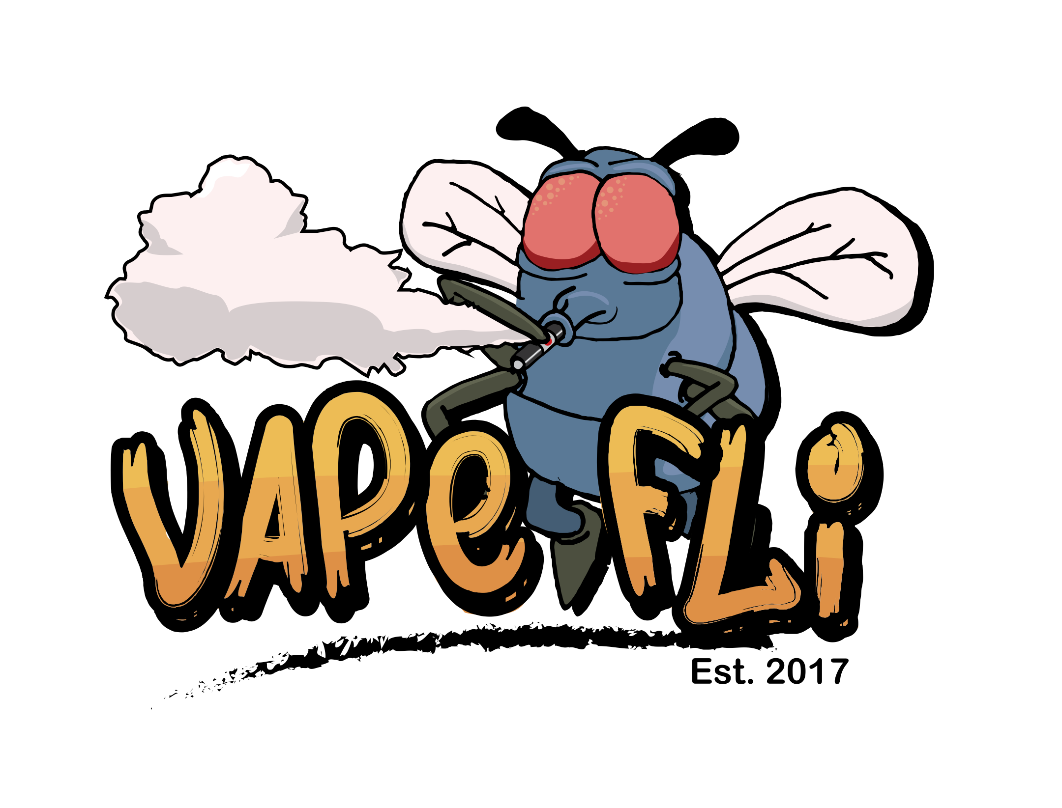
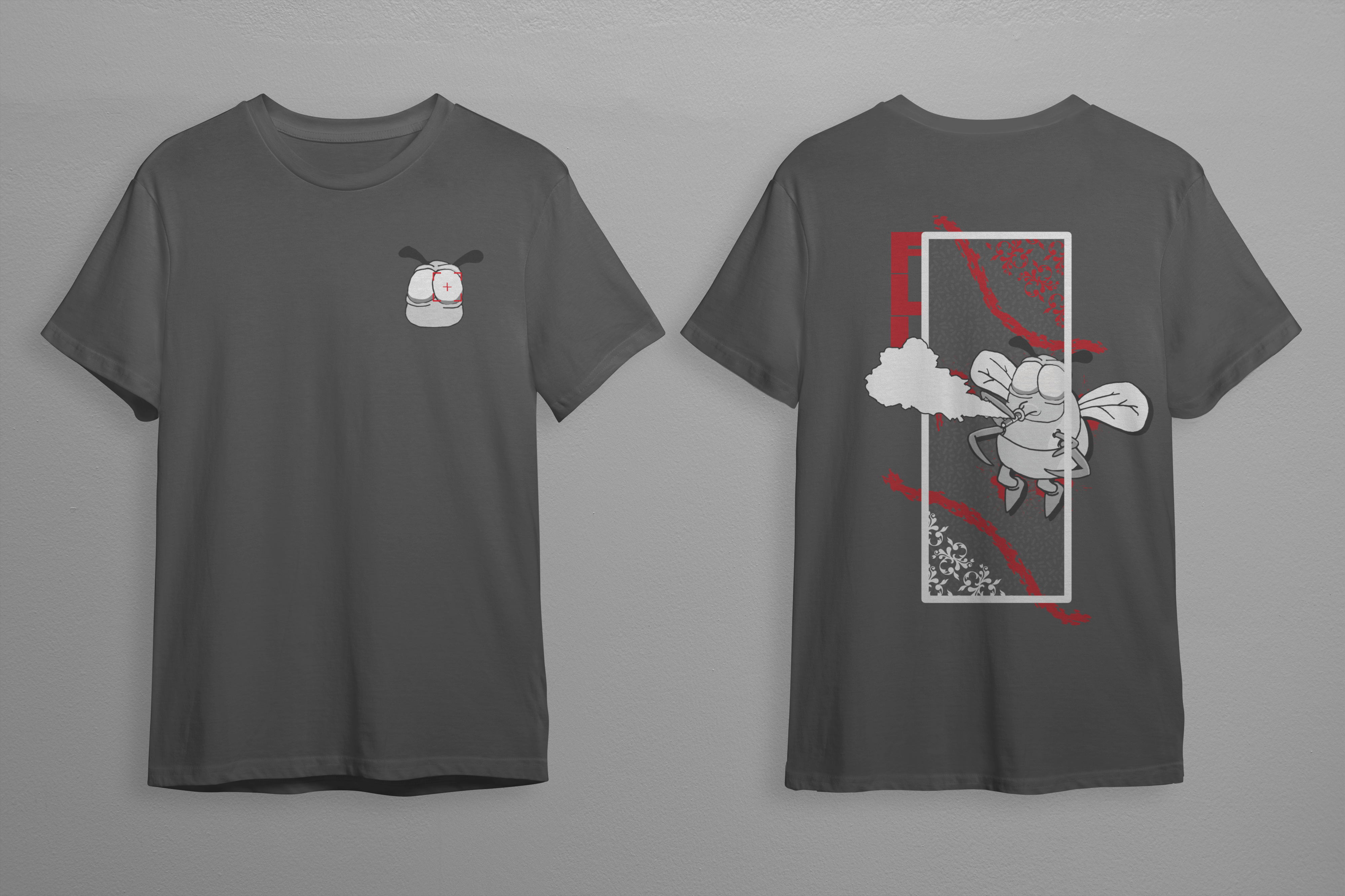
The identity pairs an illustrated beetle mascot with sharp red framing and black-and-white contrast. The character gives the retailer a memorable anchor while the high-contrast palette leaves room for product names and flavour labels.
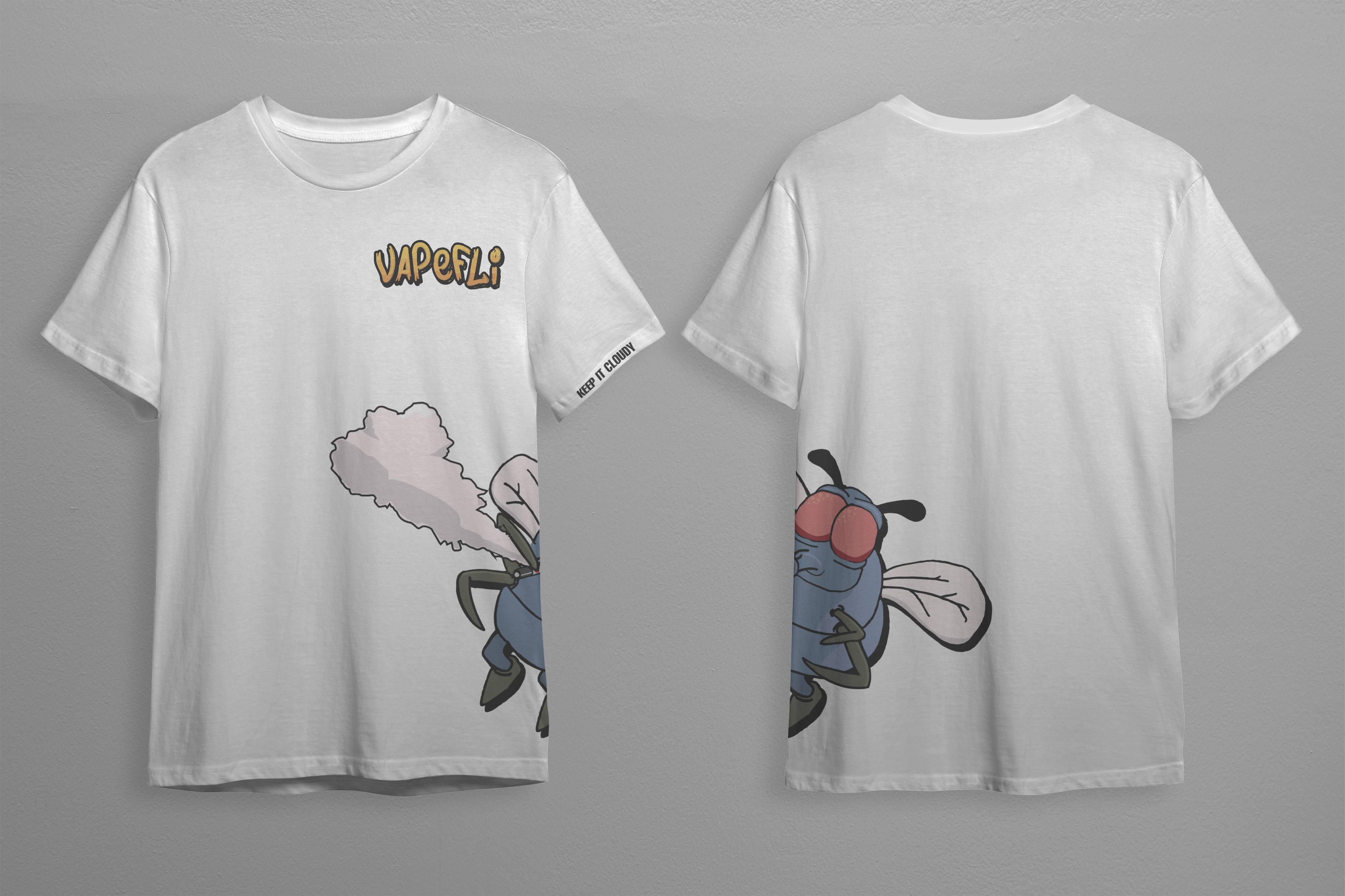
The range includes more than 30 in-house e-liquid flavours, so naming and packaging need a consistent way to distinguish variants. The same visual system can carry from product labels to store material without losing the shop’s character.
WEY / VAPEFLI
VapeFli is a vape retailer in Lydenburg, Mpumalanga. The brief was to make the shop easier to recognise in a crowded category and to speak to both new and returning customers without relying on generic product imagery. The range includes more than 30 in-house e-liquid flavours, so names and variants need a consistent way to be presented.
The direction pairs an illustrated beetle mascot with sharp red framing and black-and-white contrast. Those elements give product labels and store graphics a common anchor while leaving room for the product details. The character adds energy; the stark palette helps the range remain legible when several items appear together.
This case study documents brand identity and packaging work. A retail website would need a separate plan for product browsing, content, checkout and delivery details. Those requirements shape the experience as much as its visual style, so they should be scoped around the products and the way the business operates.